homebuddy
making off-campus housing search stress-free
Overview: One of the problems that Cornell students face is the task of finding off-campus housing. Students often to consider a variety of aspects, including but not limited to: location, price, and amenities. There are various complaints about the process being stressful, confusing, and not centralized. How can we design a centralized product that lessens the burden, makes the platform more user-friendly, and the process stress-free?
We first collaborated to deliver a deck proposal with medium-fidelity diagrams for an off-campus housing app product. Later, I made revisions to the medium-fidelity diagrams to create a final prototype of the product.
Housing? A Stressful Conversation
At Cornell, it is a known fact that every fall, in August or September, the task of finding off-campus housing preoccupies a majority of the student body. Whether it be lining up in front of rental offices or chasing down landlords, Cornell students have voiced their complaints and frustrations with regards to finding off-campus housing options.
Problem Space
From talking to users who experienced the hunt for off-campus housing, we found some key insights:
- users cannot find a comprehensive platform that lists all the off-campus housing options
- it is difficult for users to coordinate correspondence with landlords via email and phone
- the process from looking at options to signing the lease is long and tedious
Target Audience
When exploring what subset of the Cornell population is considering off-campus housing, we found 3 general groups:
- sophomores - because of convenience and greater flexibility in meal plans and options
- juniors/seniors - because of unguaranteed on-campus housing options
- graduate students - different consumer segment, accomodations differ in terms of location, pricing, distance, etc.
Thus, we decided to focus on undergraduate students as our main target audience.
Market Analysis
What is the market size?
- Total undergraduate enrollment: 15,182 students
- Total sophomores, juniors, seniors = 15,182 - 3,325 = 11,857 students
Taking into account that not all sophomores, juniors, and seniors live off campus, we can estimate the market size to be around ~9,500 students.
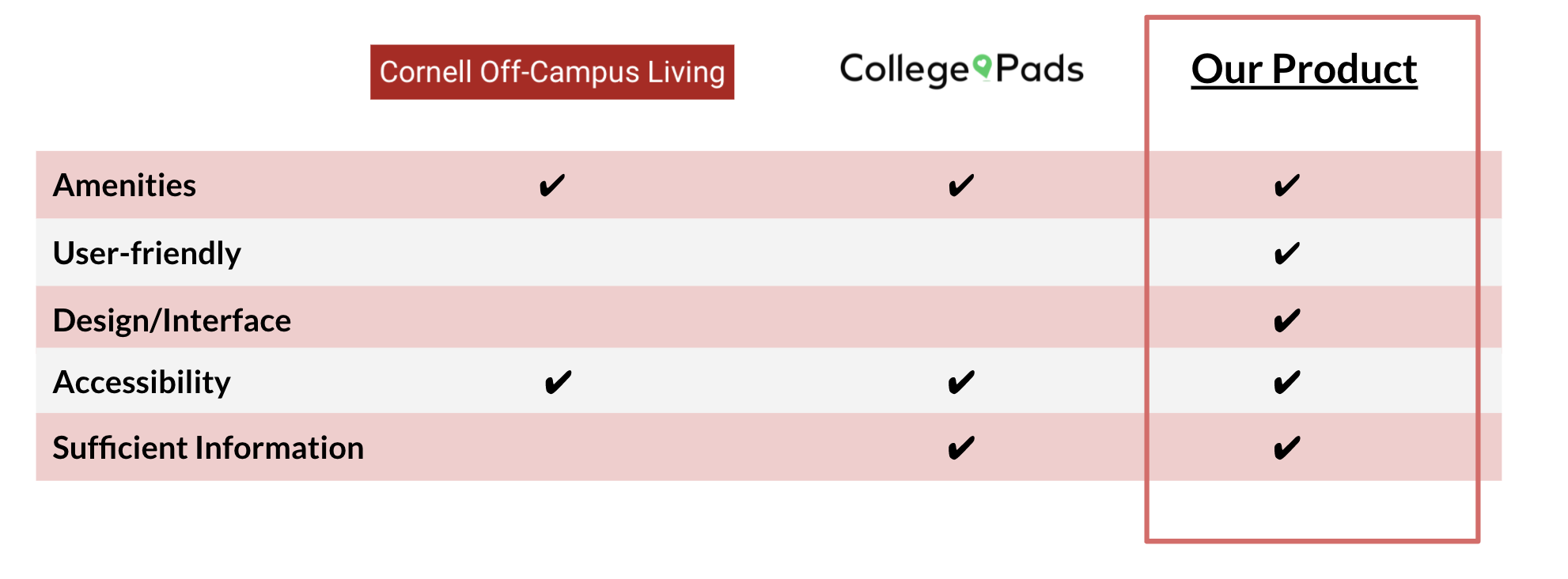
Competitors
We found some existing websites included: Cornell Off-Campus Living and College Pads
How to Alleviate Stress?
Brainstorming
Based on the prior research and the user interviews we conducted, we decided to categorize the findings via affinity diagrams.
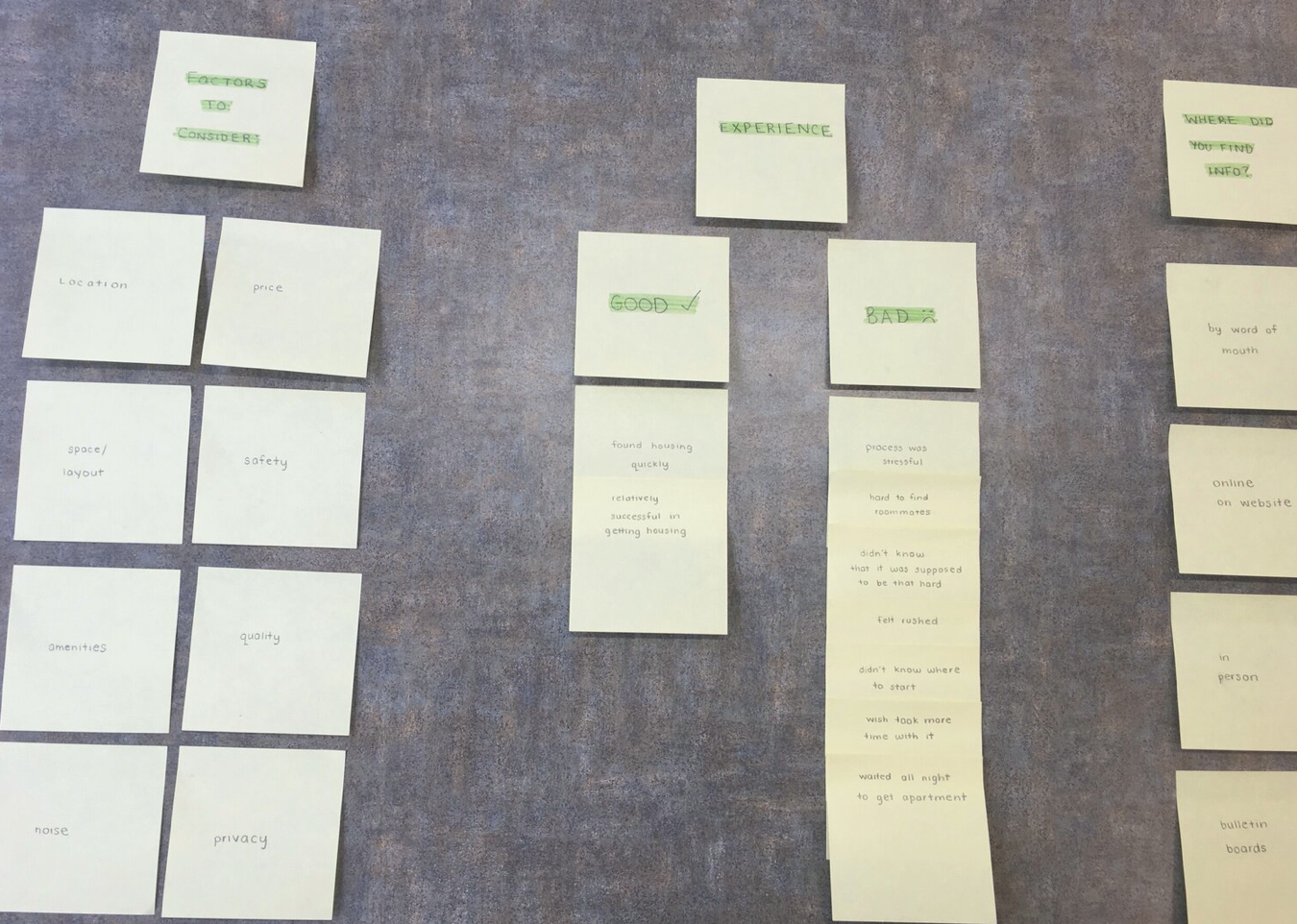
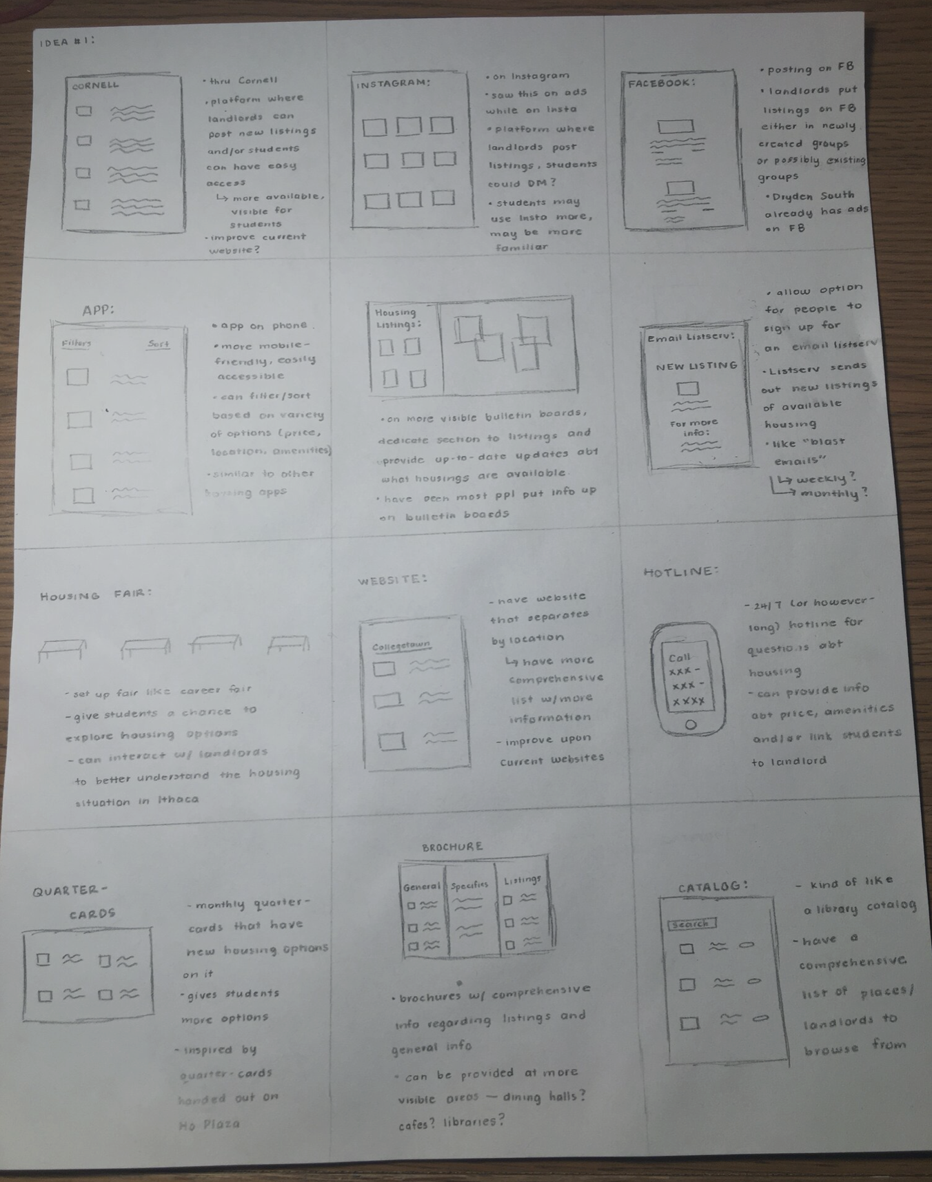
After categorizing these findings, we decided to sketch some possible ideas and designs for the new product. Below are some of the low-fidelity sketches that I drew:
Choosing an idea
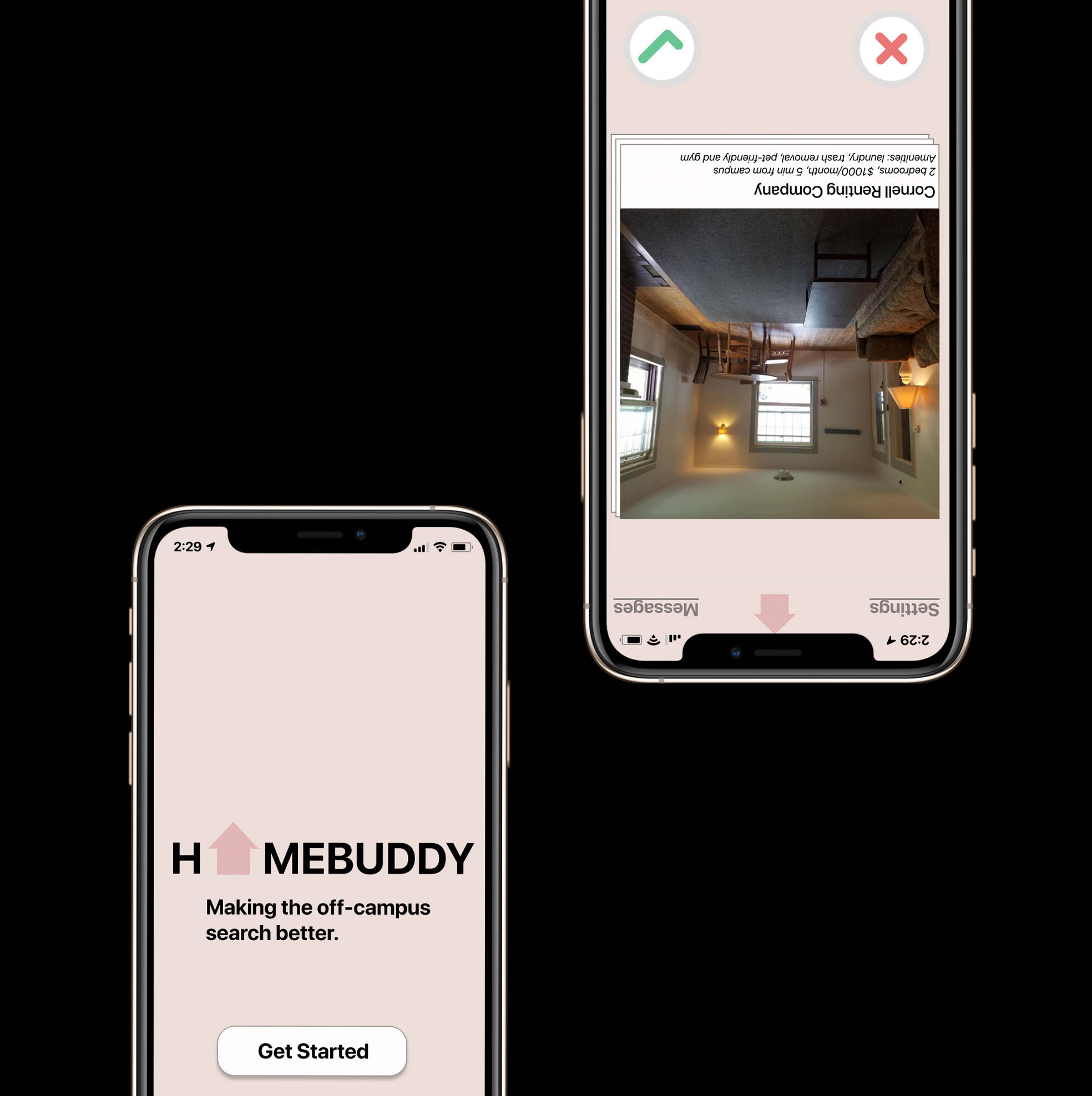
From all of our sketches, we decided to pursue a Tinder-inspired app product to address our problem space.
This app will:
- contain relevant information that most of the users found necessarily for off-campus housing, including: location, distance, cost, amenities
- show user housing based on preferences
- enable users to "swipe" on housing they like and be matched with landlords/rental companies
- provide users with a "favorites" list to document their favorite listings
Why Did We Choose This?
- this solution will make the act of searching for off-campus housing less stressful and more interactive
- there is a comprehensive list of housing available that fulfill the users’ preferences addresses user pain points
- it has a high value and low cost. This app solves our problem statement through the creation of a centralized product
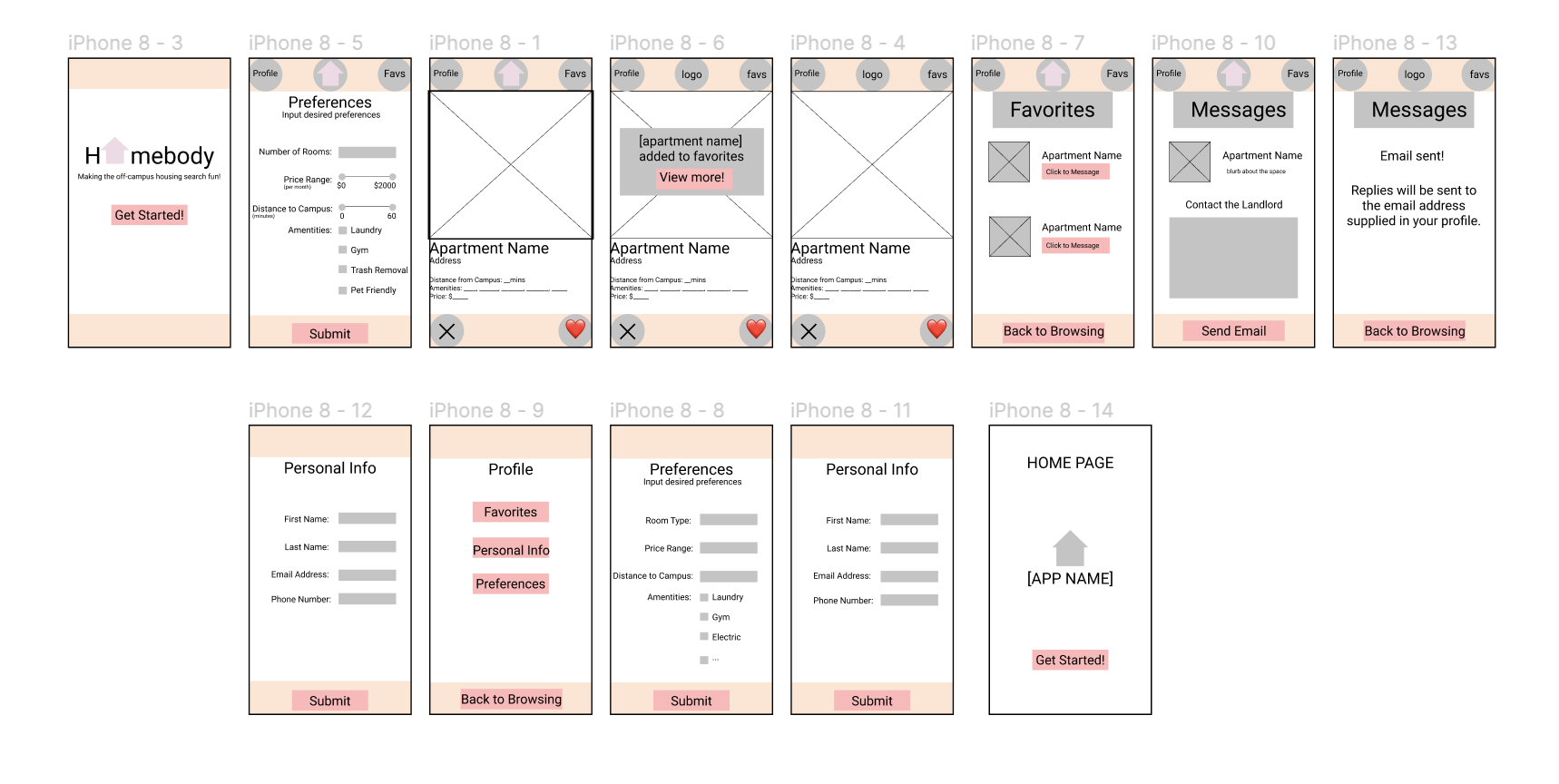
Medium Fidelity Flow
After coming up with a solution, our group decided to create a medium-fidelity sketch to get a general visual of how the app will work.
Swipe Right or Left on the App Idea?
Formative Usability Testing and Summative Tests
Using these low fidelity sketches, we conducted usability testing and summative tests to gain user feedback. Some of the metrics that we measured include:
- Time Spent: how long it took to complete task
- Success Rate: how well task was completed
Some of the overall takeaways/findings:
- User would appreciate a screen with instructions explaining how the app works
- User needed prompting getting started and clarity about the “favs” page and how to get to “preference”
Adding a Splash of Sophistication
In the weeks after the course ended, I decided to make further revisions on our medium-fidelity flow to create a final prototype for our product. Taking the user feedback and general visual design principles, I generated a high-fidelity flow for the product. Below is an overview of the final product:
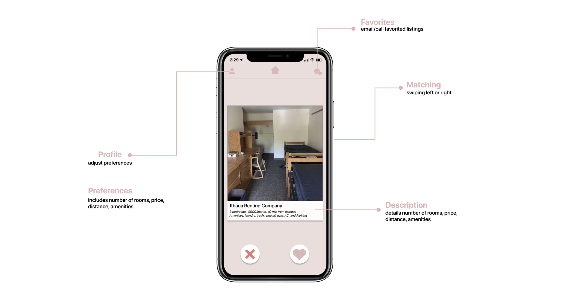
01. Creating a Profile
When users first get started, they can create a new profile that includes pertinent information for housing, including price range, distance to campus, number of rooms, and amenities.
02. Get Swiping
After users input their preferences, the listings will be filtered based on the preferences. Swipe right to save the listing to the favorited list, swipe left to move on to the next listing. Similarly, the user can click on the ✖️ or ❤.
03. Contacting Listings
The user can contact landlords and rental companies via the "messages" tab in the right hand corner; this "messages" tab includes all the listings that the user favorited.